ExtJS SingleSelectCombo Widget
Installation
easy_install tw.extjs
Usage
The SingleSelectCombo widget is a widget derived from the SingleSelectField widget and thus supports all parameters and validation rules supported by a SingleSelectField. In addition it renders the widget as a ComboBox allowing autocomplete and write ahead features. All defined in the ExtJS ComboBox widget API can be used by extending this widget. In its present form, in addition to the SingleSelectField parameters, it supports the following:
Mandatory Parameters:
- id The element id of the select field element.
Optional Parameters:
- typeAhead Whether the remaining portion of the field will be
- automatically populated by the first matching option. (Default: True)
- triggerAction Action to execute when the trigger field is
- activated. (Default: ‘all’)
- width The width of the field in px. (Default: ‘auto’)
- forceSelection Whether to restrict the user to enter values
- available in the options list. Setting it to False will allow the user to enter arbitrary values in the field. (Default: True)
In its simplest form the widget can be instantiated as follows:
from tw.extjs import SingleSelectCombo

select_options = [('AL','Alabama'), ('AK','Alaska'), ('AZ','Arizona'), ...... ('WY','Wyoming')]

ssc = SingleSelectCombo(id="states", options=select_options)
It can be then served up to the user via a controller method like this:
@expose('mypackage.templates.myformtemplate')
def entry(self, **kw):
    pylons.c.field = ssc
    return dict(value=kw)
The widget can then be displayed in the template like this:
${tmpl_context.field(value=value)}
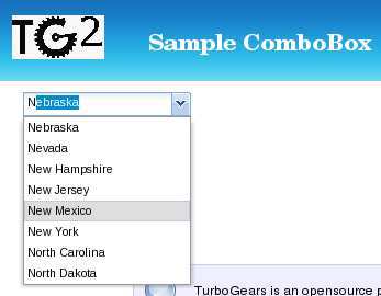
This is how it looks like in the browser:
Todo
Difficulty: Medium. extend tutorial to include the SingleSelectCombo widget in a Form
Todo
Difficulty: Medium. extend the tutorial to populate the options list by sending a JSON request
Todo
Difficulty: Medium. extend the tutorial to have form field validation