JQuery Flot Widget
The FlotWidget class of tw.jquery makes it easy to use the powerful Flot library from Python.
Flot is a pure Javascript plotting library for jQuery. It produces graphical plots of arbitrary datasets on-the-fly client-side.
The focus is on simple usage (all settings are optional), attractive looks and interactive features like zooming and mouse tracking.
Installation
easy_install tw.jquery
Usage
The FlotWidget widget supports the following parameters:
Mandatory Parameters:
data must be a list of data series:
data = [series1, series2, ... ]
A series can either be raw data or an dictionary with items. The raw data format is an list of points:
[(x1, y1), (x2, y2), ... ]
For instance, the first series coould be defined as:
series1 = [(1, 3), (2, 14.01), (3.5, 3.14)]
Note that to simplify the internal logic in Flot both the x and y values must be numbers, even if specifying time series (see below for how to do this). This is a common problem because you might retrieve data from the database and serialize them directly to JSON without noticing the wrong type.
If a null is specified as a point or if one of the coordinates is null or couldn’t be converted to a number, the point is ignored when drawing. As a special case, a null value for lines is interpreted as a line segment end, i.e. the point before and after the null value are not connected.
The format of a single series dictionary is as follows:
{
  'color': color or number,
  'data': rawdata,
  'label': string,
  'lines': specific lines options,
  'bars': specific bars options,
  'points': specific points options,
  'xaxis': 1 or 2,
  'yaxis': 1 or 2,
  'shadowSize': number
}
You don’t have to specify any of them except the data, the rest are options that will get default values. Typically you’d only specify label and data, like this:
series2 = dict(label='y = 3', data=[(0, 3), (10, 3)])
The label is used for the legend; if you don’t specify one, the series will not show up in the legend.
If you don’t specify color, the series will get a color from the auto-generated colors. The color is either a CSS color specification (like “rgb(255, 100, 123)”) or an integer that specifies which of auto-generated colors to select, e.g. 0 will get color no. 0, etc.
The latter is mostly useful if you let the user add and remove series, in which case you can hard-code the color index to prevent the colors from jumping around between the series.
The ‘xaxis’ and ‘yaxis’ options specify which axis to use; specify 2 to get the secondary axis (x axis at top or y axis to the right). E.g., you can use this to make a dual axis plot by specifying
dict(yaxis=2)for one data series.The rest of the options are the same as the default options that can be directly passed as a widget parameter. When you specify them for a specific data series, they will override the default options for the plot for that data series.
Here’s a complete example of a simple data specification:
data = [
    dict(label='Foo', data=[(10, 1), (17, -14), (30, 5)]),
    dict(label='Bar', data=[(11, 13), (19, 11), (30, -7)])
]
Optional Parameters:
id sets the element id of the div element containing the flot graph.
- width sets the width of the flot graph.
Must be specified as a string with units, e.g. ‘400px’.
- height sets the height of the flot graph.
Must be specified as a string with units, e.g. ‘200px’.
- label can be a label for the whole flot graph.
Do not confuse this with the labels for individual data series mentioned above.
- options are the flot default options.
All of these options are completely optional. They are documented in the Flot API documentation. For instance, you can set:
options = dict(lines=dict(show=True), points=dict(show)=True))
For example, the widget could be instantiated like this:
from tw.jquery import FlotWidget

flot = FlotWidget(id='flot', width='320px',height='160px',
    label='Simple Flot Example')
You can try this in a small example project “flotsample” to draw some example data. The root controller could be as follows:
import math
from tg import expose, tmpl_context
from tw.jquery import FlotWidget
flot = FlotWidget(id='flotSample', width='320px',height='160px',
label='Simple Flot Example')
class RootController(BaseController):
@expose('flotsample.templates.index')
def index(self):
tmpl_context.flot = flot
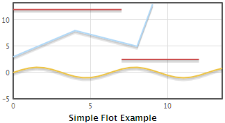
d1 = [(0.5*i, math.sin(0.5*i)) for i in range(0,28)]
d2 = [(0, 3), (4, 8), (8, 5), (9, 13)]
# a None value signifies separate line segments
d3 = [(0, 12), (7, 12), None, (7, 2.5), (12, 2.5)]
return dict(page='index', data=[d1, d2, d3])
The widget can be displayed in the flotsample.templates.index template by:
<div py:replace="tmpl_context.flot(data=data)"/>
Our simple example graph will now be drawn like this:
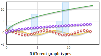
Flot supports lines, points, filled areas, bars and any combinations of these, in the same plot and even on the same data series. Instead of lists with raw data, we need to pass dictionaries for the individual series. Here is an example:
@expose('flotsample.templates.index')
def index(self):
    tmpl_context.flot = flot
    d1 = [(0.5*i, math.sin(0.5*i)) for i in range(0, 28)]
    d2 = [(0, 3), (4, 8), (8, 5), (9, 13)]
    d3 = [(0.5*i, math.cos(0.5*i)) for i in range(0, 28)]
    d4 = [(0.1*i, math.sqrt(i)) for i in range(0, 140)]
    d5 = [(0.5*i, math.sqrt(0.5*i)) for i in range(0, 28)]
    data = [
        dict(data=d1, lines=dict(show=True, fill=True)),
        dict(data=d2, bars=dict(show=True)),
        dict(data=d3, points=dict(show=True)),
        dict(data=d4, lines=dict(show=True)),
        dict(data=d5, lines=dict(show=True), points=dict(show=True))
    ]
    return dict(page='index', data=data,
        label='Different graph types')
Note that we passed a different label to be displayed to the template. In the template, we must pass that label to the widget. It will then override the default label the widget was instantiated with:
<div py:replace="tmpl_context.flot(data=data, label=label)"/>
This is how our second example is displayed:
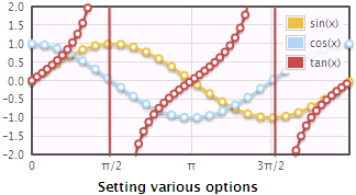
There are plenty of options you can set to control the precise looks of your plot. You can control the axes, the legend, the default graph type, the look of grid, etc. Luckily, Flot goes to great lengths to provide sensible defaults which you can then customize as needed for your particular application. Here is a more complex example showing how to set various options:
@expose('flotsample.templates.index')
def index(self):
    tmpl_context.flot = flot
    d1 = []
    d2 = []
    i = 0
    while i < 2*math.pi:
        d1.append((i, math.sin(i)))
        d2.append((i, math.cos(i)))
        i += 0.25
    d3 = []
    i = 0
    while i < 2*math.pi:
        d3.append((i, math.tan(i)))
        i += 0.1
    data = [
        dict(label='sin(x)', data=d1),
        dict(label='cos(x)', data=d2),
        dict(label='tan(x)', data=d3)
    ]
    options = dict(
        lines=dict(show=True),
        points=dict(show=True),
        xaxis=dict(ticks=[0,
            (math.pi/2, u'\u03c0/2'), (math.pi, u'\u03c0'),
            (math.pi*3/2, u'3\u03c0/2'), (math.pi*2, u'2\u03c0')]),
        yaxis=dict(ticks=10, min=-2, max=2),
        grid=dict(backgroundColor='#fffaff'))
    return dict(page='index', data=data, options=options,
        label='Setting various options')
Again, we need to adapt the template a little in order to pass our custom options to the widget:
<div py:replace="tmpl_context.flot(data=data, label=label, options=options)"/>
This will now be displayed as follows:
All possible options are documented in the Flot API.